Close to the University of Florida
Close to North Florida Regional Medical Center
In a neighborhood with a high percentage of people age 40 to 49
In a neighborhood with high housing values.
The activity used more of the GIS spatial analysis tools to create raster map layers that could be combined in weighted overlays based on the priority of the above criteria to locate prime areas for locating a new home for the couple.

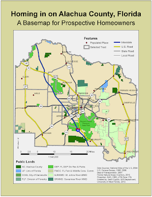
The first map is a base map of Alachua County showing populated places, roads, public lands and census tracts within the county. The idea of the basemap is to provide the clients with an overview of the area to give them a real sense of the areas that may meet their priorities so they can have additional information to help make their decision. The base map was fairly straightforward to put together once I got passed issues I had with setting the data frame properties per the activity instructions to a Universal Transverse Mercator (UTM) projection for Florida Zone 17N. After doing so, I kept getting messages when importing layers that the data frame projection did not match the layer. I was not expecting those messages and was not sure I didn't need to re-project the layers in ArcCatalog first but confirmed this was not the case through the class discussion board, though I'm still unsure why. Projections may be the death of me yet.
I do like the final product. I think the color scheme is good and I am pleased with the symbology and labelling of the roads. I find the label manager more and more a useful tool and consider that one of the best ESRI courses I've taken in association with the GIS program. I added a label for Payne's Prairie because it was a large public land close to many populated areas. Also, I've been there. In fact I actually spent about eight months based in Alachua County tracking manatees for the U.S. Fish and Wildlife service. Those were good times.

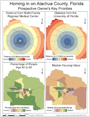
The next map shows the raster layers that were created based on the different priorities listed above. The two maps at the top show the distance in ~3 mile bands from the hospital and the university and where created using the Spatial Analysis Distance tool called Euclidean Distance and the Reclassify tool. I had some difficulties with the university map because the maps were supposed to be limited through setting the raster analysis environment to the extent of the selected tracts layer. However, my analysis was not being limited to that extent. Luckily, other students encountered similar problems and I was able to get advice to rectify the problem by resetting the raster environment to the geodatabase on my drive each time. Eventually, the problem went away but it was a pain for a little bit.
I like how I set the legends for the raster layers here. Also, I chose the 3-D symbols for the hospital and university because I thought they'd be more visually appealing to the clients.

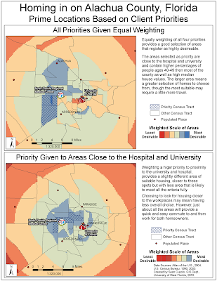
The last map took the raster layers created for the four maps in the previous image and used GIS ability to make custom tools to combine the four layers into a weighted overlay. Two overlays were created, one where the four priorities where given equal weighting and one where the weighting was 40% and 40% toward proximity to the university and hospital and 10% and 10% toward the demographic and housing values. The later weighting was due to the amount of traffic in the area leading the couple to decide that it was more important to be close to work then be in neighborhoods with people their own age or with high housing values. on the map, I've summarized the pros and cons of each weighting. The analysis for the maps to create the overlays was easily performed. The big effort here was in making the results into a presentable display. Hopefully, I accomplished that goal and created a set of informational maps that could help the prospective couple find a home that best suites their desires.

No comments:
Post a Comment