Saturday, July 24, 2010

Module 10: Homeland Security - Protect

Module 10 is the final module in the Applications for GIS class before the Final Project. It is a continuation of the previous week's work which was preparing Homeland Security layers for a simulated threat to North America Aerospace Defense Command (NORAD). Last week all the layers were prepared and this week analyses was done based on those layers.

Three of the maps from this weeks module are posted here. I'm at a loss for anything to say about these other then that I was very confused throughout the exercise by many of the instructions that seemed fairly reasonable but did not seem to work correctly and may be because the previous weeks data was not prepared correctly due differences in the previous weeks instructions and things that needed to be done such as repairing data sources and re-projecting layers.

Unfortunately, at this point I've invested way too much time in the lab to start from scratch and am posting the items that were completed as best I could.
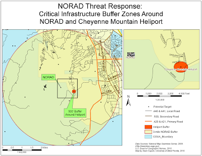


The first map shows a 500 foot buffer around a heliport that is within the initial 3-mile buffer around the entrance to NORAD that was created to identify critical infrastructure that may be involved in secondary threats in the event of a threat targeting NORAD itself. None of the steps was difficult but when I selected GNIS points to get critical infrastructure within the buffer, only 49 sites were selected (not 50). However, the one outlier site was right along the border so I just selected it and continued on. I did have the exact mix of sites by Feature Class.However, I think there might e an issue with my projections though I'm not sure what it is and why it's occurring. I seem to be getting datum conflicts when running the various Arctools. They don't stop the tool from processing though but are just warnings.
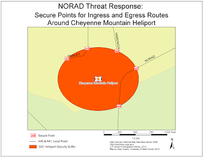


The next map is a blow up of the buffer around the heliport where ingress and egress points were identified for the roads leading to the heliport. These roads will need to be secured in the event of an actual threat so locating where to set up the checkpoints to secure them is the purpose of the map. I like the symbols that I found for these points. They were in the ERS Homeland Security set. Again, nothing was difficult about creating the map, but I think the distances may be slightly off.

The last map shows a line of site analysis for points around the entrance to NORAD. The purpose of the map is to provide site line information to enable the placement of monitoring locations and surveillance cameras to allow all areas around and leading into NORAD to be properly surveyed for threats.
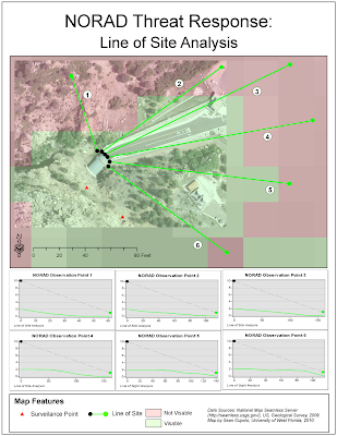


I had the most difficulty getting this map together. First there was problems creating a hillside shading raster from the initial DEM file provided. I had to take the file provided this week, follow last weeks exercise to re-project it and then I could get the hillshade to look the way I believe it should. At that point the exercise in generating a viewshed gave all kinds of problems. First we had to create surveillance points based on a description in the lab as to where to put them that did not give a good idea where they needed to go or how many to place. Inti ally I placed some on the entrance road. When I ran my viewshed, it showed all areas as visible. so I re-edited my points and tried again. Note that running the viewshed analysis at that time took at least twenty minutes a go. I thought maybe created my Hillshade file incorrectly, but am not sure because the lab does not tell you to use this file, it says use the DEM layer. However, that layer seemed to give me worse results (about half the DEM layer was green), So finally, I recreated the hillshade layer and set my points at only 2 and was able to get non-visible areas. Problems were encountered with the 3D Analyst Line of Site tool because the tool was defaulted on the DEM layer and so each line of site that was set was not reading off the correct layer to plot a line of site profile graph. When I realized that, I was able to complete the map as shown. Again, however, moving on and trying to complete the final step which was to show the line of site in ArcScene, failed completely as my lines of site show way too far from the Orthoimage of NORAD to make sense.

Sunday, July 04, 2010

Module 8 Law Enforcemet: Washington DC

The posted maps where completed for the Week 8 activity if the University of West Florida On-Line GIS Certification program class, Applications in GIS (GIS4048). The focus of the week was Law Enforcement and GIS and the goal of the activity was to use GIS to analyze crime and police station data and make recommendations based on the data for adjustments to current patrols.

Maps are being posted now. Background to follow:


The first map is a base map of Washington DC showing the location of police stations and crime incidents that occurred in August 2009.


The next map shows crime proximity to the police stations. The proximity color bands were created using a Multiple Ring Buffer tool to measure proximity at intervals of 0.5, 1.0 and 2.0 Miles from each station.


The third map shows Crime Densities for three specific types of crime: Burglary, Sex Abuse and Homicide. The densities were created using a GIS Spatial Analysis tool called, Kernel Density.


The final map also uses the Kernel Density tool to show a time series snap-shot of auto theft crimes based on when they occur in a 24-hour day.

The biggest issue I had in developing these maps was the slow refresh rate of the computer. For some reason, every adjutment to a map I made required long refresh times. I tried to use the Map Cache toolbar to alleviate the re-draws but it did not seem to be working for me. The lab also included some time savers like saving a Base Map to use over and over again. Unfortunately, I failed to get my basemap set correctly at the beginning based on the later labs so I still ended up with a lot of redo work which was particularly painful in regards to trying to get the road labels to diplay correctly. I did figure out a useful trick though on the fourth map which was that it was just as easy to compy the first data frame with all it's layers in it to three additional layers (then the Frame Properties were already set). I also found it easier to compose the map before adding everything. Finally, I had major problems using the graphing tool on this lab such that I decide it was more effective to export data from the graph tool to an Excel spreadsheet and create the graph there then copy it back to the map. The last two graphs were done using these procedures and they look much better then the first one.

Tuesday, June 29, 2010

Week 7: Location Decisions - On Your Own

The maps displayed in the post below were completed as part of the University of West Florida On-line GIS Certification program class, Applications of Geographic Information Systems (GIS4048/5100). The maps were completed for the week 7 assignment which was to create a similar set of maps as last weeks activity except tailored to a proximity search of the students desire.

I chose to do a similar proximity study to last weeks based on the search for a new home in Marion County, Florida by a couple, John and Wilma Green. The fictitious Greens are searching for a home in mostly rural Marion county in hopes of finding a good value house that fulfills their dream of living on a decent-sized lake, say 200 Acres of more. Mr. Green still needs to commute to his job along Interstate 75 (I-75) and so is also looking for a location that is close to an entrance/exit to I-75, though not too close. The Greens are also avid bicyclists and are interested in finding property that is close to designated bicycle trails. Finally, the Greens are hoping to find a home that is no in a less dense area of the county.

A package of maps has been prepared for the Greens to introduce them to Marion County and highlight areas within the county that may best meet their needs based on the aforementioned criteria.


The first is a base map of the county that highlights some if it's more noteworthy features include the towns, roads and public lands, as well as lakes and bicycle trails. The Greens can use this map to help them become oriented with where places and features are located as they continue to search for a home.


The next map, the Personalized Preference map, has been prepared using the various criteria specified by the Greens as important in their home location decision. They specified six criteria:

1. Proximity to the on/off ramps for Interstate 75
2. Proximity to Interstate 75, but not too close.
3. Areas that have lower population density.
4. Areas that have higher property values.
5. Proximity to designated bicycle routes.
6. Proximity to a reasonably sized lake (preferably on the lake).

The map shows the results of the analysis for determining how close an area within the county is to each of the physical features or how various areas rank in regard to population density and home value.


Finally, the last map shows two weighted analysis preformed using the GIS program by weighting each of the Green's priorities based on how important they were. In the map on the left, the Greens specified that the most important thing to them was vicinity to a lake and so that was rated highest in the overlay (30%). Population Density was next most important (20%), followed by house Value and proximity to bike trails. The highway criteria were each weighted at 10% i hopes of finding properties along that corridor that were good bets. The best choices, several actually adjoining lakefronts are shown as the darkest blue areas.

For the weighted map on the right, concern about proximity to the highway was removed as an issue entirely, though proximity to exits was left in at 15%. The idea was to be that the exit criteria would draw in more areas that ranked high that were close to the highway in the north near the border of Alachua County around Orange Lake. However, somewhat surprisingly, that did not occur. More areas did meet the new criteria but more were in a corridor east of the highway but the Orange Lake area still did not register as a top priority for the home search. It's possible the rankings for the exits/entrances were not recorded in a manner needed to generate the anticipated result. Unfortunately, time was of the essence and since both maps provided useful data for the Greens, they were included in the final home search package.

Monday, June 21, 2010

Week 6 Location Decisions

The posted maps were created for the Week Six module for the University of West Florida's on-line Geographic Information System Certification class, Applications in GIS (GIS 4048). The module was the second in a block of activities focused on urban planning. The focus of the activity was to use GIS to help answer a "where" question. In this case, the question was where to look for a home for a prospective couple, a doctor and a college professor, moving to Alachua County, Florida based on four specific priorities:

Close to the University of Florida
Close to North Florida Regional Medical Center
In a neighborhood with a high percentage of people age 40 to 49
In a neighborhood with high housing values.

The activity used more of the GIS spatial analysis tools to create raster map layers that could be combined in weighted overlays based on the priority of the above criteria to locate prime areas for locating a new home for the couple.


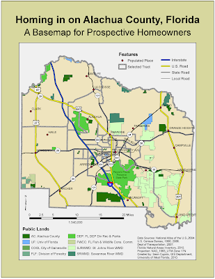
The first map is a base map of Alachua County showing populated places, roads, public lands and census tracts within the county. The idea of the basemap is to provide the clients with an overview of the area to give them a real sense of the areas that may meet their priorities so they can have additional information to help make their decision. The base map was fairly straightforward to put together once I got passed issues I had with setting the data frame properties per the activity instructions to a Universal Transverse Mercator (UTM) projection for Florida Zone 17N. After doing so, I kept getting messages when importing layers that the data frame projection did not match the layer. I was not expecting those messages and was not sure I didn't need to re-project the layers in ArcCatalog first but confirmed this was not the case through the class discussion board, though I'm still unsure why. Projections may be the death of me yet.

I do like the final product. I think the color scheme is good and I am pleased with the symbology and labelling of the roads. I find the label manager more and more a useful tool and consider that one of the best ESRI courses I've taken in association with the GIS program. I added a label for Payne's Prairie because it was a large public land close to many populated areas. Also, I've been there. In fact I actually spent about eight months based in Alachua County tracking manatees for the U.S. Fish and Wildlife service. Those were good times.


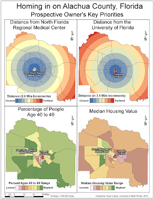
The next map shows the raster layers that were created based on the different priorities listed above. The two maps at the top show the distance in ~3 mile bands from the hospital and the university and where created using the Spatial Analysis Distance tool called Euclidean Distance and the Reclassify tool. I had some difficulties with the university map because the maps were supposed to be limited through setting the raster analysis environment to the extent of the selected tracts layer. However, my analysis was not being limited to that extent. Luckily, other students encountered similar problems and I was able to get advice to rectify the problem by resetting the raster environment to the geodatabase on my drive each time. Eventually, the problem went away but it was a pain for a little bit.

I like how I set the legends for the raster layers here. Also, I chose the 3-D symbols for the hospital and university because I thought they'd be more visually appealing to the clients.


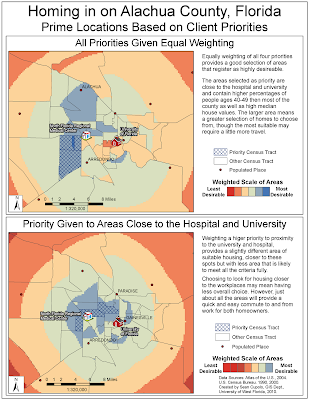
The last map took the raster layers created for the four maps in the previous image and used GIS ability to make custom tools to combine the four layers into a weighted overlay. Two overlays were created, one where the four priorities where given equal weighting and one where the weighting was 40% and 40% toward proximity to the university and hospital and 10% and 10% toward the demographic and housing values. The later weighting was due to the amount of traffic in the area leading the couple to decide that it was more important to be close to work then be in neighborhoods with people their own age or with high housing values. on the map, I've summarized the pros and cons of each weighting. The analysis for the maps to create the overlays was easily performed. The big effort here was in making the results into a presentable display. Hopefully, I accomplished that goal and created a set of informational maps that could help the prospective couple find a home that best suites their desires.

Sunday, June 13, 2010

Module 4: Urban Planning and Impact Assessments

The posted maps were created for the week five module for the University of West Florida's on-line Geographic Information System Certification class, Applications in GIS (GIS 4048). The focus of the weeks assignments was Urban Planning and Impact Assessment and the maps were created as part of the exercises in the Environmental Systems Research Institute (ESRI) My Learning class, Introduction to Urban Planning and Regional Planning Using ArcGIS, Impact Assessment using ArcGIS9, Module 5. The module covered four types of impact assessment, environmental, social, economic and visual. The first three resulted in maps generated in ArcGIS and the fourth, which was optional for the class, is a screen shot of a 3-D image created using data from ArcGIS imported into ArcScene.


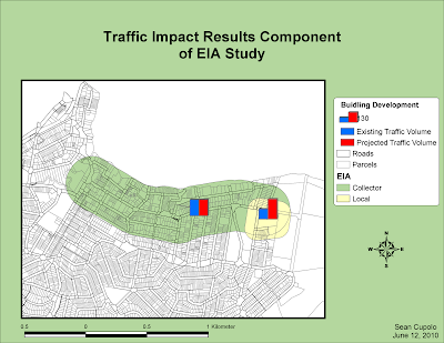
The first map shows an Environmental Impact Assessment performed on a fictional research building project for a university. The goal was to use GIS to analyze whether traffic would be affected in two zones impacted by the building - a collector zone defined as the region within 200 meters of the main road that leads into the site and a local zone close to the proposed research center. ArcGIS analysis tools were used to create buffers around both zones and then the zones were merged into one layer. Collected impact data was input into the database associated with the layer and corresponding symbology, showing bar graphs, very clearly indicates the effect of the project on each zone.


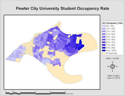
The second map is a social identity map that highlights the concentration of university students residing in a fictional city. The map was created using the location and analysis capabilities of a GIS by first eliminating unoccupied areas and then using the databases tied to the spatial information in the GIS to calculate the concentration (by percentage) of university students in different geographic blocks within the city.


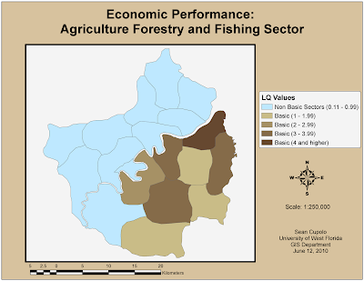
The final map for the week shows an economic assessment of a specific industry sector based on how well that industry performs in different local government authorities (LGA) in a fictional region (specifically, the region around Pewter City, the subject of the previous analysis's). The assessment is based on a Location Quotient (LQ) Assessment of each LGA to determine if the industry sector in that LGA can be described as basic, meaning primarily serves markets outside the area thus bringing money in or non-basic, meaning the industry primarily serves local customers. An LQ over one indicates an industry is a basic industry and using this type of assessment in combination with the GIS spatial abilities to categorize and display the data allows for the clear indication of where geographically the industry is more likely to serve local or outside markets.


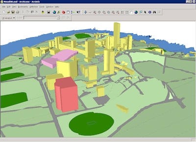
The final image is not a map but a screen shot of a 3-D image created in ArcScene based on data from ArcGIS. The section of the lesson was focused on a visual impact assessment which is a study done to try to determine how the population in an area will be affected by the a project in terms of things like blocked views or aesthetically unpleasing site lines that dampen peoples enthusiasm for the project.

The light pink area in the image is the area in question where the new project will go and the building behind it with the central tower is the centerpiece building of the university considering the project. ArcGIS has a 3-D extension that allows a height element to be added to the data set to create the images in the screen shot. The 3-D image can be used along with a 2-D map created in ArcGIS that shows the site lines as defined features on the 2-D map and links them to actual photos taken from these site lines. Unfortunately, I could not get the linking to work properly to the photos because of the way the paths were set up in our E-Desktop. If I do maybe I'll re-post another image.

Natural Hazards Participation Activity - Deepwater Horizon Spill

The Role of GIS in Disaster Response

The role of GIS in disaster response can be summarized in one word: information. When a disaster occurs, it is generally without warning and with potentially devastating impacts on people, infrastructure and natural resources. The need to be able to quickly determine where the danger lies and what impacts the disaster will have are critical to mitigating those impacts and, very probably, saving lives. Processing information quickly, efficiently and accurately is a necessity. Additionally, most disasters have a spatial element to them, whether it is buildings destroyed by an earthquake, forests burned down by a fire or roads blocked by debris from a hurricane. When conditions on the ground change, the need to find a way to represent those changes in a meaningful way is high. Maps are natural conduits of such information that are understandable to most people. By being able to combine large amounts of data into the summarized format of an easily understandable map, a GIS has the ability to excel over most other data acquisition and analysis systems and as such really shines in a disaster situation.

There are many examples of the role of GIS in disaster response from 911 to Hurricane Katrina. Currently, the Deepwater Horizon Oil Spill in the Gulf of Mexico is an all consuming disaster that is impacting the region immediately and will continue to impact not just the Gulf but the entire country, possibly the world, for years, maybe decades, to come. Almost from the beginning, GIS has been a component in the response as detailed in an article posted to the web-site, GIS and Science (http://gisandscience.com/2010/06/04/gis-response-to-deepwater-horizon-oil-spill-an-update-from-drew-stephens-at-the-gis-institute/). The article reports, “Beginning April 30, a team of ”GIS Smoke Jumpers” from across the USA deployed to Houma, LA to build and operate an enterprise-class GIS for the (sic) Houma Incident Command Post (ICP) in Louisiana.” The staff at first was assisting the Coast Guard with such things as over-flight/plume mapping and now have the Louisiana National Guard “posting data directly to a server from the field”. Presently, their database has over 150 layers of base map and operational data including a Google Earth application. GIS staff, the articles mentions, hosted members of the response Unified Command including representatives from the Departments of the Interior and Homeland Security, Louisiana’s Governor’s Office, the Army National Guard, the Air Force, US Fish and Wildlife and others. The article ends with the quote, “There are now many more senior-level administrators who understand the power of GIS!”

Whether it is mapping the spill plume, determining where oil is likely to come ashore, identifying areas of sensitive shoreline and wildlife, closing fisheries areas, determining impacts to businesses and local governments, directing response resources and managing responders or just providing information to a public that desires to better understand and relate the magnitude of the spill to their day-to-day lives, GIS can play a role. And the roles can change daily. For example, this morning, a C-Span interview with a Pensacola journalist, Carl Wernickle from the Pensacola News Journal, indicated that the government would like British Petroleum (BP) to turn over one to ten billion dollars to state, local and federal governments to manage, another area ripe for correlation with affected areas within a GIS. As longs as there are people, there will be disasters and a need for skilled GIS personnel to help manage the information needed to manage the disaster.

Animation Activity

The below link is to an avi animation of the Deepwater Oil Spill showing it's extent over several days from April 29th to May 20th with the projected trajectory as of May 26th. The file is an example of how a GIS can be used to create an "animated" map that can show how data changes over time, in this case the oil plume. I had some problems with the file. I could make the avi movie easy enough but when I tried to make adjustements I could not seem to get the file to work correctly. I wanted the movie to end on the May 26th projections and stay there but it kept defaulting back to the beginning. Unfortunately, the TS server has no method for reading avi file and so in order to view it I had to record the file which took about 3 minutes for me, then copy it to my pc which took another several minutes. The process became somewhat frustrating and I decided I'd just stick with what I had.

Deepwater Spill Animation

Sunday, June 06, 2010

Module 4: Deepwater Horizon Oil Spill

The posted maps were created for the week four module for the University of West Florida's on-line Geographic Information System Certification class, Applications in GIS (GIS 4048). The focus of the module is the current on-going Deepwater Horizon oil spill and it's potential impacts on the coast of Florida. The maps were created using Environmental Systems Research Institute (ESRI) ArdGIS 9.3 software.

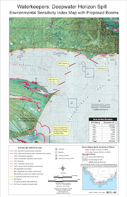
The goal for the assignment was to create maps that could be used by a local monitoring organization, Waterkeepers, to help in the protection of the coastline from the spill. The type of maps used in this type of response operation are called Environmental Sensitivity Index maps and their purpose is to give map readers a good indication of where the most sensitive resources are in an area impacted by a spill.


The first map is a modified ESI map showing a quad section of the west Florida coastline identified as WEST PASS, FLA (1992) W. FL-45. The map shows shoreline sensitivity classifications based on the ESI shoreline index as well as managed lands and socio-economic points that could be adversely affected by the drifting oil spill if it makes landfall in the area. It also shows the proposed layout of booms to protect the area from the oil.

Notes on map creation: There were a lot of difficulties creating the map, chief among them being getting the Quad raster layer to project into the correct location on the map. Additionally, because of the original scanning resolution the Quad looks terrible when viewed in ArcMap itself and has to be turned off to for the rest of the work.

Other issues were related to the symbology and calculation of the footage for the ESI shoreline classifications as well as the booms and classification of managed lands. I could not find the recommended symbol to use for Marine Sanctuary and spent like an hour trying to find it in all the symbology collections before I realized the amount of Marine Sanctuary land on my map was minimal. In the end since most of the map area was covered by two Wildlife refuges, Apalachicola Bay Aquatic Preserve and St. Vincent Island NWR, I removed the symbology completely for these items and used labels and a note to indicate the extent of managed land.


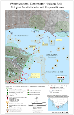
The second map shows the Biological ESI Map for the same Quad. The ESI system uses set symbology for area and point data to be presented that can be related back to a database of information on the species found in the area, breeding sensitivity and times, and overall sensitivity to the disruption caused by oil coming ashore. For the map, the proposed booms were kept in place to visualize whether they would be effective in protecting keep biological areas.

Notes on Map Creation: For this map I re-symbolized the raster layer into a black and white layer which is more in keeping with ESI standards. I did not do that with the first map because the underlying quad was too obscured and did not look good however, on the biological map the black and white was necessary to allow for the various biological polygons to appear. I had major issues with trying to relate the data found in each biological layer to some outside database that would help me identify key species. In the end, doing so to such an exacting standard was out of scope of the assignment and instead a listing of species with their probable habitat locations was don instead. I really liked the idea of the point biological symbology and was disappointed the map data cannot be more accurate. However, the data is based on a recent ESI map of the same area and so should be reasonably accurate.

Most of the legend and list of species was done manually, image by image but I feel it gives the map a much more polished look then a simple table or list would have.

For the Reptile and Invertebrate layers, I needed to create a new field to code how I wanted the data symbolized in order to exclude large polygons that covered all of the water or all of St Vincent Island. I also realized I needed a simple blue background for water areas because the black and white on that part of the quad obscured too much. I used the managed lands layer to accomplish this as well as part of the invertebrate layer. However, the effect is clearly a more readable map then otherwise would have been.