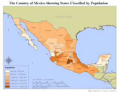
The first map is a chloropleth map of the states of the country of Mexico classified by six population ranges. The map demonstrated the technique of creating a unique layer by extracting map data from another layer. In this case the political boundaries of the Mexican states were extracted from a layer that showed political boundaries for states from several countries including the United State as well. Constructing the map was relatively hassle free though a lot of time was spent lining up elements such as the legend and scale bars. Note that there are scale bars for both miles and kilometers which seemed like an important feature to have as the map readers may use one or the other as their basic measure of distance.

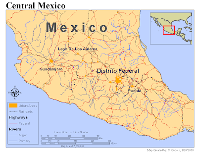
Map 2 shows the major highways, railroads, rivers and urban areas of central Mexico. The map was generated after adding several additional feature layers to the previous map, re-layering features, turning off other features and adjusting the scale to 1:5,000,000. The inset map was added by creating a second data frame and using the Extent Rectangles property to link the layers in the main map to the inset drawing to display the red rectangle. Much of the time on the map was spent trying to find appropriate color schemes for the background, linear features and urban polygons so all stood out appropriately. Also, the legend, because it had elements from multiple layers, was a challenge to adjust and display properly.
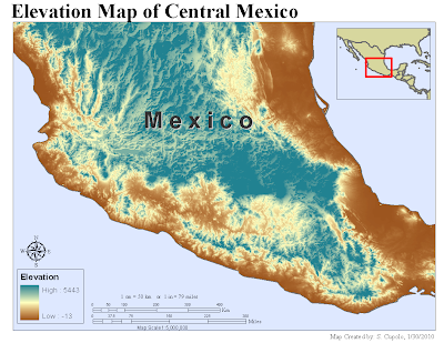
 The last map was created by adding a raster layer of elevations to the preceding map, turning off the linear (rivers, roads, etc.) and political layers and adjusting elements accordingly. The color scheme was the hardest thing to determine for the map because it required a graduated color ramp as can be scene in the legend and it was hard to find one that seemed suitable. Ultimately, the one chosen seemed the best way to display the variations in terrain elevation from the coasts to the mountains. The biggest issue with putting the map together was waiting for it to redraw itself after a change to the color ramp.


