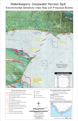
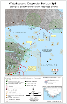
The goal for the assignment was to create maps that could be used by a local monitoring organization, Waterkeepers, to help in the protection of the coastline from the spill. The type of maps used in this type of response operation are called Environmental Sensitivity Index maps and their purpose is to give map readers a good indication of where the most sensitive resources are in an area impacted by a spill.

The first map is a modified ESI map showing a quad section of the west Florida coastline identified as WEST PASS, FLA (1992) W. FL-45. The map shows shoreline sensitivity classifications based on the ESI shoreline index as well as managed lands and socio-economic points that could be adversely affected by the drifting oil spill if it makes landfall in the area. It also shows the proposed layout of booms to protect the area from the oil.
Notes on map creation: There were a lot of difficulties creating the map, chief among them being getting the Quad raster layer to project into the correct location on the map. Additionally, because of the original scanning resolution the Quad looks terrible when viewed in ArcMap itself and has to be turned off to for the rest of the work.
Other issues were related to the symbology and calculation of the footage for the ESI shoreline classifications as well as the booms and classification of managed lands. I could not find the recommended symbol to use for Marine Sanctuary and spent like an hour trying to find it in all the symbology collections before I realized the amount of Marine Sanctuary land on my map was minimal. In the end since most of the map area was covered by two Wildlife refuges, Apalachicola Bay Aquatic Preserve and St. Vincent Island NWR, I removed the symbology completely for these items and used labels and a note to indicate the extent of managed land.

The second map shows the Biological ESI Map for the same Quad. The ESI system uses set symbology for area and point data to be presented that can be related back to a database of information on the species found in the area, breeding sensitivity and times, and overall sensitivity to the disruption caused by oil coming ashore. For the map, the proposed booms were kept in place to visualize whether they would be effective in protecting keep biological areas.
Notes on Map Creation: For this map I re-symbolized the raster layer into a black and white layer which is more in keeping with ESI standards. I did not do that with the first map because the underlying quad was too obscured and did not look good however, on the biological map the black and white was necessary to allow for the various biological polygons to appear. I had major issues with trying to relate the data found in each biological layer to some outside database that would help me identify key species. In the end, doing so to such an exacting standard was out of scope of the assignment and instead a listing of species with their probable habitat locations was don instead. I really liked the idea of the point biological symbology and was disappointed the map data cannot be more accurate. However, the data is based on a recent ESI map of the same area and so should be reasonably accurate.
Most of the legend and list of species was done manually, image by image but I feel it gives the map a much more polished look then a simple table or list would have.
For the Reptile and Invertebrate layers, I needed to create a new field to code how I wanted the data symbolized in order to exclude large polygons that covered all of the water or all of St Vincent Island. I also realized I needed a simple blue background for water areas because the black and white on that part of the quad obscured too much. I used the managed lands layer to accomplish this as well as part of the invertebrate layer. However, the effect is clearly a more readable map then otherwise would have been.

Impressive Sean!
ReplyDelete