Tuesday, June 01, 2010

GIS Applications: Hurricane Katrina

The following maps were created for the second module of the Natural Hazards block of activities for the 2010 University of West Florida Online GIS Certification Program class - Applications of Geographic Information Systems (GIS4048/5100)

The focus of the module was hurricanes and the maps focus on studying the effects of storm surge from Hurricane Katrina on three counties from the state of Mississippi, Hancock, Harrison and Jefferson.
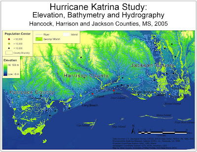

The first map is the base map for the study and shows the elevation, bathymetry and hydrography of the three counties and surrounding areas including barrier islands, rivers, swamps/marsh land and population centers that could possibly be affected by the storm surge related to the Hurricane. The map uses an elevation raster layer to show which areas are low lying and potential flood dangers.

Big challenges in putting the map together were deciding what to label and making sure the labels did not conflict or otherwise become displaced in a visually unappealing way and figuring out the best way to frame the main map with other map elements such as the legends to best effect. The second was a big challenge because the actual features displayed in the map are not uniformly regular on a horizontal plane but were rather diagonal. So a big task in map layout was finding a way to cover a large white space in the upper left section of the map. Legends were used for the purpose but for some reason I had a tremendously difficult time lining them up properly.

The label manager tool really came in handy for this map. I had decided with the population centers that it would be valuable to show them categorized by population and doing so made it clear which ones should be labeled since only seven had populations over 10,000. The label manager's SQL query allowed me to label only those seven places. A similar technique was followed with the rivers. Because the layer is so extensive and includes streams and other linear water features, it made sense to only label shapes that were actually tagged as rivers. Offsetting features in the label manager also made a big difference especially in making the island labels legible (and helping fill a lot of blue space). Finally, I could not get the Hancock County label to fit properly so I used the label manager to display the other two county labels and created one for Hancock using the drawing tools.
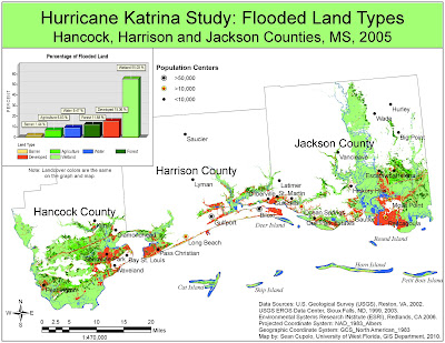


The next map is combined with a chart based on the data from the map and together the two show which land types were flooded by the Hurricane in the same three Mississippi counties. The map was created using some of the more powerful spatial analysis tools that are available with ArcGIS that make it a good tool for the type of analysis done. The elevation layer from the previous map was analyzed to isolate land that is lower then 15 feet above sea level, the height of Katrina's storm surge in Mississippi. The initial land cover layer which shows various types of land was then combined with the below 15 foot layer and the data in the initial land cover file was reclassified to the simpler types shown in the map. Once all that was done a graph was made using ArcMaps graphing tools and added to the map. I spent a lot of time playing with the graph to get it to display the way I wanted, there were many advanced features available. Some of the ones I really liked were being able to match the colors to the map so that I could use the graph legend as a map legend as well, also the labels on each bar graph showing the actual percentage give the graph some weight and visual appeal.
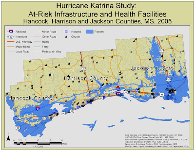


The final map shows infrastructure, particularly roads, railroads, hospitals and churches that were potentially affected by the Hurricane storm surge. Additionally, the map shows churches and railroads that were potentially not affected which could be used as relief centers and supply conduits respectively. The map, due to the vast road network displayed would have been a bear to get finished if not for a tip from another student about using the Map Cache toolbar which presumably creates a memory cache for you map and enables redraws to occur really quickly. Don't know how I'd have gotten the map done without that as I had a lot of trouble getting the road symbols to work. The road file had about 39,000 records in it I believe, each on a shape one the map.

All in all, I'm pretty happy with these three maps, they were a lot of work.

Monday, May 24, 2010

A New Beginning ......

Our Story So Far

After having completed the first 2 classes in the University of West Florida GIS Certification, students have now moved on to GIS 4048 Applications in GIS (and GIS4990 GIS Programming - but there is nothing to post for that class).

The following maps were part of the first GIS assignment for the class, Earthquakes, part of a three week Natural Hazards unit demonstrating the applicability of GIS for use in Natural Hazard identification, mitigation, preparedness, response and recovery. The maps were created using ArcGIS 9.3 software and come from the Environmental Sciences Research Institute (ESRI) Virtual Campus course - Spatial Analysis of Geohazards Using ArcGIS 9.

I'm just posting the maps and not providing details on their creation at this time due to deadlines for the course. These posts were not required for class, but the maps took some time and look pretty good, so I wanted to put them up here.


The first map shows vulnerable railroads within the shake zone of an fours earthquakes that occurred near New Madrid, Missouri in 1811-1812. The railroad and road data is from today and the map demonstrates how looking at historical earthquake information provides insight into the effect a similar earthquake would have today in an area that at the time was very sparsely populated but is now close to some major urban area. The rairoads in the map that are identified all fall within Modified Mercalli Scale (MMI) Zone X wherein the intensity of shaking is such that rails could be bent.


The second map is a comparison of Building Damage Density, a measure taken by using GIS to count all the damaged or destroyed buildings located in an area around the epicenter of the 1994 Northridge California earthquake, to Peak Ground Velocity (PGV)measurments of the surrounding land. PGV was calculated using a GIS spatial anlysis techning called splining which is based on the location and attribute data of all the earthquake measuring stations located in the area.


The final two maps show distribution and other data related to aftershocks from the Northridge earthquake.

Tuesday, April 27, 2010

Tuesday, April 06, 2010

The posted maps were completed for the Week 11 Lab for the University of West Florida Online GIS Certification program class, Introduction to Geographic Information Systems (GIS 4043/L). The maps was created using the ArcGIS ArcMap program and based on data from ESRI Virtual Campus courses.

Creating and Editing Labels and Annotation

I was planning on taking this ESRI course anyway so doing it for class worked out well. I'm going to go back and do the Annotation module over the break between classes provided I can do so.

Here are the two maps from the ESRI exercises:


Learning ArcGIS Spatial Analyst

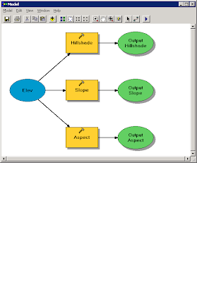
The first part of the ESRI Spatial Analyst Tools course focused on process models. The following image is the process model created for the exercise:

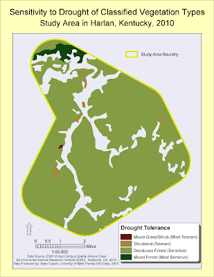
The second part focused on reclassifying data. The map below shows the vegetation layer reclassified and masked to show new classifications based on drought tolerance within a predefined study area:


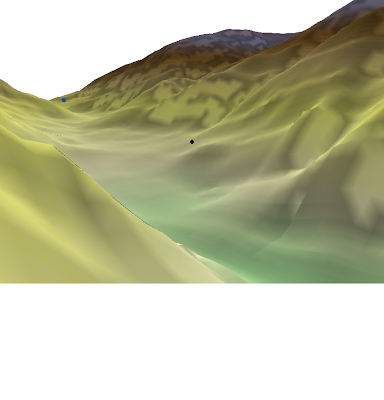
The last map was created from the ArcGIS 3D Analyst module:


I actually went through, finished the module and passed the exam. I wanted to make a video but was not sure how to do it so just decided to post this image. I was not sure how to get the image though but found that you could post it to the clipboard which is what I did and then posted the clipboard to the Paint program to save it as a PNG file. I hope to go back and play with the Fly features some time in the future.

Friday, March 19, 2010

Week 9 - Vector Analysis II

The posted map was completed for the Week 9 Lab for the University of West Florida Online GIS Certification program class, Introduction to Geographic Information Systems (GIS 4043/L). The map was created using the ArcGIS ArcMap program.


This was a fun lab. I learned a lot and was challenged to think through the steps to get what was needed. I enjoyed this one quite a bit.

Lab Questions

Q1: Which tool was used: I used the Identity tool because it combines portions of features that overlap. The end results gave me the exact same set of overlay features as the Union overlay (I laid them on top of each other to verify). However, the intermediate step when the overlay was applied looked quite different as several areas were "missing". This makes sense when you look at the graphical depictions and read the overlay descriptions in the lab because Union combines features from both layers but Identity only combines portions of features that overlap. In this case because the road was my input feature the overlay created essentially matches the road buffer such that when over-layed on the original Union overlay you can see the discrepancies (See image below).


Off course now that I went to all this trouble I realize that I could have probably just used the Intersect Overlay and saved myself a step (and I thought I was being clever).

Q2 Which tool to exclude conservation areas: The Erase tool was used to exclude conservation areas because it excludes areas in the erase feature, here the conservation_area layer, that overlap the input feature or in our case the buffers_union layer.

Q3 How many features were in the possible sites layer: There were 79 features in the layer, the largest had an area of 7,765,034.49 Sq. Meters (7.7 Sq Km) and the smallest was 748.11 Sq. Meters.

Monday, March 15, 2010

Spring Break Fun!

The posted map was completed as an optional exercise during Spring Break the University of West Florida Online GIS Certification program class, Introduction to Geographic Information Systems (GIS 4043/L). The map was created use ArcGIS based on recent data downloaded from the State of Florida Department of Revenue.


The goal of the exercise was to take a ArcGIS shapefile of land parcels for Gulf County, Florida and join the parcel data to associated Tax Roll Data that was compiled as a table into a Comma Separated Value (CSV) file then use the information and the ArcGIS functions to determine the top four landholders in the county.

The instructions for the exercise were straightforward as was using ArcGIS to compile and analyze the information to obtain the desired result, a testament to the power and utility of a GIS system, particularly when the sources exist to provide the desired information. As someone with a lot of database and file conversion experience, I was very comfortable using the tools that are available in ArcMap much to my delight. I actually spent more time trying to compose a visually interesting map that displays the data in an easily identifiable way. Hopefully the final map outputed here does so.

Tuesday, March 02, 2010

Week 7 Data Editing in ArcGIS

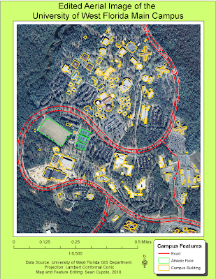
The posted map was completed for the Week 7 Lab for the University of West Florida Online GIS Certification program class, Introduction to Geographic Information Systems (GIS 4043/L). The map is the same as was posted for the Week 6 Lab but several features have either been edited or added to the vector shapefiles on the map including adding a new feature shapefile for Athletic fields.


The lab was pretty straight-forward and required following the steps learned in the previous part of the lab as part of the ESRI Learning ArcGIS class. The only tip I could offer is to be patient while digitizing and do not be afraid to delete and start over.