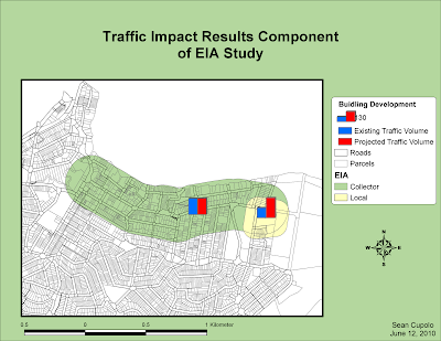
The first map shows an Environmental Impact Assessment performed on a fictional research building project for a university. The goal was to use GIS to analyze whether traffic would be affected in two zones impacted by the building - a collector zone defined as the region within 200 meters of the main road that leads into the site and a local zone close to the proposed research center. ArcGIS analysis tools were used to create buffers around both zones and then the zones were merged into one layer. Collected impact data was input into the database associated with the layer and corresponding symbology, showing bar graphs, very clearly indicates the effect of the project on each zone.

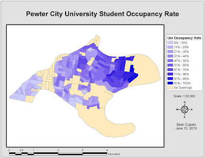
The second map is a social identity map that highlights the concentration of university students residing in a fictional city. The map was created using the location and analysis capabilities of a GIS by first eliminating unoccupied areas and then using the databases tied to the spatial information in the GIS to calculate the concentration (by percentage) of university students in different geographic blocks within the city.

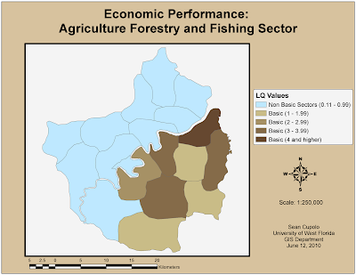
The final map for the week shows an economic assessment of a specific industry sector based on how well that industry performs in different local government authorities (LGA) in a fictional region (specifically, the region around Pewter City, the subject of the previous analysis's). The assessment is based on a Location Quotient (LQ) Assessment of each LGA to determine if the industry sector in that LGA can be described as basic, meaning primarily serves markets outside the area thus bringing money in or non-basic, meaning the industry primarily serves local customers. An LQ over one indicates an industry is a basic industry and using this type of assessment in combination with the GIS spatial abilities to categorize and display the data allows for the clear indication of where geographically the industry is more likely to serve local or outside markets.

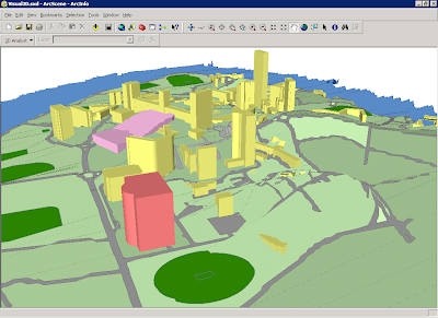
The final image is not a map but a screen shot of a 3-D image created in ArcScene based on data from ArcGIS. The section of the lesson was focused on a visual impact assessment which is a study done to try to determine how the population in an area will be affected by the a project in terms of things like blocked views or aesthetically unpleasing site lines that dampen peoples enthusiasm for the project.
The light pink area in the image is the area in question where the new project will go and the building behind it with the central tower is the centerpiece building of the university considering the project. ArcGIS has a 3-D extension that allows a height element to be added to the data set to create the images in the screen shot. The 3-D image can be used along with a 2-D map created in ArcGIS that shows the site lines as defined features on the 2-D map and links them to actual photos taken from these site lines. Unfortunately, I could not get the linking to work properly to the photos because of the way the paths were set up in our E-Desktop. If I do maybe I'll re-post another image.

No comments:
Post a Comment