Wednesday, February 24, 2010
Week 6 - Georeferencing Assignment
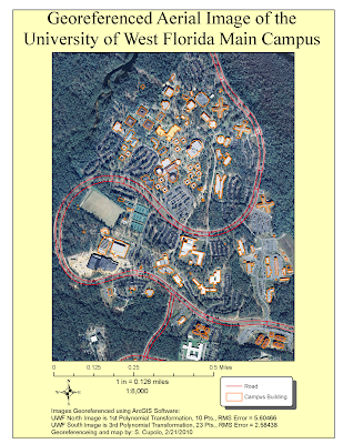
Having done some digitizing in the past I was a little familiar with the concept presented here but thought it was interesting to see how the images, especially the south section, moved after each point was referenced. The keys to being successful I thought were patience and the willingness to go back and re-evaluate all your previous points based on their Root Mean Square (RMS) value and image correctness after continuing to add points. Often I found that I could delete an old point whose RMS had gone up to ~7 or 8 and redo the point to an RMS of ~4 or 5 lowering the overall RMS total. I also found that it was important to try to place points on the road, provided it was relatively easy to select a location such as an intersection or crosswalk where you could be relatively close in your reference. Doing so seemed to be the best way to get the road image to line up with the road vector.
Wednesday, February 17, 2010
Week 5 - GIS Data Search Assignment
The first map shows Hydrology and Man-made features of Indian River County, Florida including the county boundary, cities & towns, major roads, line and polygon hydrography and wetlands. Additionally, I have added DRG, DEM and DOQQ raster datasets to 3 adjacent quads across the middle of the county. I learned quite a bit making the map but spent way too much time on it. In particular I was not happy with the way some of the downloaded files attribute tables classified information and wanted to make my own but could not figure out how to add a text field to the attribute table and then fill it in, something I hope to learn soon. I was lucky with the shape of the county as it lent itself to leaving open areas for legends and such. I left my Florida layer turned on because it adds some extra contrast to the legends. All my shape files came from the Florida Geographic Data Library for this map and the next one. All were in the Alber's Conic projection.
The raster files came from the Land Boundary Information System (LABINS) and I attempted to re-project each of the layers to the Alber's projection which prove to be highly difficult and fraught with confusing results that may not be 100% successful. The DOQQ maps were the easiest because they were already in Alber's projections with matching False Easting and other information. By far the most difficult was the DRG because I could not seem to get the un-collared file to re-project properly.
Okay, this one is a little much, but I'm giving myself an E or A for Effort. I spent way too much time trying to work the elements of the map into a presentable theme and I'm not sure I was 100% successful. I probably should have provided less detail but even though it's a busy map, I do think everything is well organized and understandable, especially at the blow-up size. So in the end I'm satisfied with it. Basically I was focusing on the public lands and tried to categorize them in a meaningful way. The attribute table had three fields that seemed reasonable - Owner, Managing_A (Association?) and ManageInst (Managing Institute) which is the one I chose though i renamed it in the legend. I thought who managed each public land was an important piece of info to display. I created my own symbols for the invasive species which was one of the coolest things I learned on the assignment, also learned how to add transparency to a layer. In the invasive species attribute table were about 14 actual species but only the four listed by name were given a separate symbol because they had more then a few occurrences. I wanted to combine two fields, Common Name and Scientific Name, into one description for the legend but forgot how to do it. If I have time (unlikely) I may try to figure that out. At the last moment I added the Archie Carr NWR inset because that was where there was a large concentration of invasive species and since that was one of the map themes I thought it was needed.
The bottom line was I learned quite a bit about ArcGIS on this exercise.
Friday, February 05, 2010
Week 4 - 3 Projections of the State of Florida
The lab demonstrated how to make changes to datasets in ArcGIS. The different map projections were generated using the ArcGIS ArcToolbox, Projections and Transformations toolset, specifically the Project Tool to create new datasets from the original Albers projection.
Generating the three maps was fairly straight-forward but setting them in layout caused some issues with the county labels and the scale. Often, when converting county labels to annotations, the scale of the map would change and had to be changed back so that all three maps matched. Additionally, setting the font proved challenging because the font would look smaller on one map then on the others even though the projections were the same. Under refresh and print preview, all would look okay so I listened to the lab instruction not to panic and things worked out.
One of the themes of the map was to show comparative areas of the four counties per projection. Inserting a table, in this case an Excel table, so the numbers could be compared next to each other seemed the best way to display such information. Creating the table required selecting - Insert => Object - locating Microsoft Office Excel Worksheet from the list, creating it as new and creating the table. Once I saved, a neat table formatted per the Excel could be sized and positioned in the map. Definitely a useful technique as an object can be added from scads of other programs as well.
Haiti Earthquake Discussion Map
There are several reasons this map was chosen. First, it seems pretty clear the map is being generated by a GIS composed of several layers - boundary, earthquake intensity, towns, roads, railroads, possibly population movement. On the USAID site the same map is shown in at least one other form, without the intensity layer, and there are some indications that the map is being updated daily. All in all, a good example of how GIS is connected to current events.
The map was also chosen because it demonstrates an interesting and important aspect of the situation in Haiti which is how population movement coincides with the level of earthquake intensity. Large populations of people are being moved from the area of highest intensity around Port-Au-Prince to areas where intensity was lower and there is presumably a better ability to provide relief services.
The one aspect of the map that I found hard to understand was the Key and associated Affected Areas boxes. The boxes show the type of relief that is being provided by certain agencies, however, there isn't a good indication on the map where geographically, those services are being delivered; a weak point because the keys dominate so much map space. Perhaps relief service area is a layer that is turned off or covered (maybe it is an area layer that conflicts with the intensity layer, the colored names of aid agencies seem to imply such). Whatever the reason, the lack of geographic context to the table data muddies the perceived impression of what the purpose of the map should be.